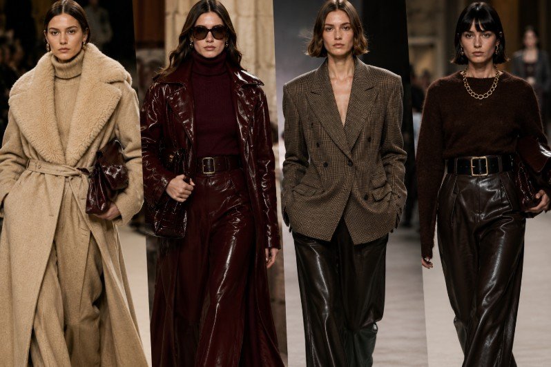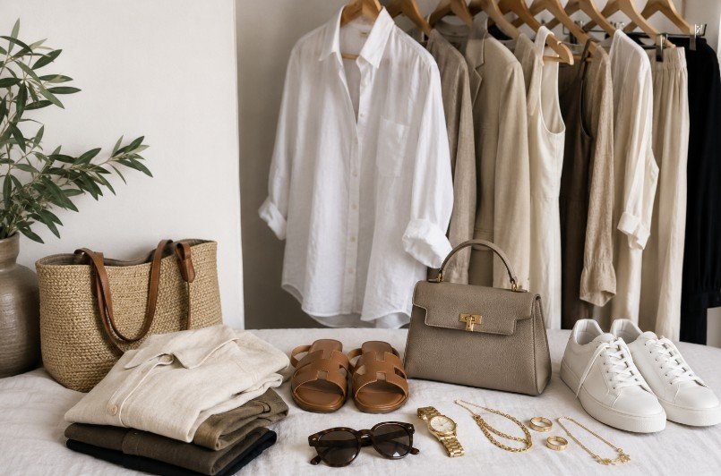
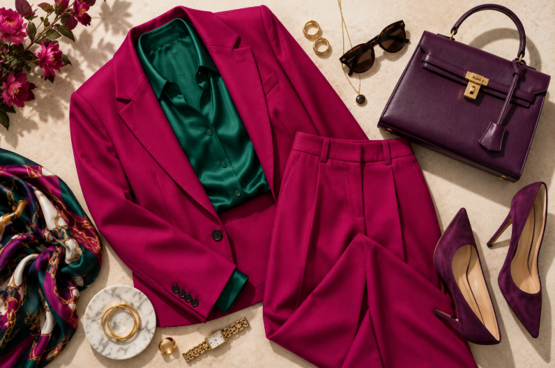
Colour can completely change the way an outfit feels. The right combination can make a simple look appear polished, sophisticated and intentional, while too many competing shades can make even beautiful pieces feel disconnected.
The good news is that dressing well with colour doesn’t require following complicated fashion rules. It is mostly about balance, proportion and knowing which shades naturally complement one another.
You don’t have to limit yourself to neutrals, nor do you need to wear a head-to-toe statement colour. The most elegant outfits often come from combining familiar shades in unexpected but harmonious ways.
Whether you love timeless beige and cream, prefer rich jewel tones or want to become more confident with colour, these simple principles will help you create outfits that feel effortlessly chic.
1. Start With a Neutral Base
One of the easiest ways to make colour feel elegant is to begin with a neutral.
Think black, white, ivory, cream, beige, camel, navy, grey or chocolate brown. These shades create a calm foundation that allows one or two more distinctive colours to stand out without overwhelming the outfit.
For example, imagine:
- Cream trousers + burgundy blouse + tan accessories
- Camel coat + ivory knit + chocolate-brown bag
- Navy trousers + white shirt + burgundy shoes
- Grey tailoring + soft pink blouse + black accessories
The neutral doesn’t have to dominate the outfit. It simply provides visual breathing room.
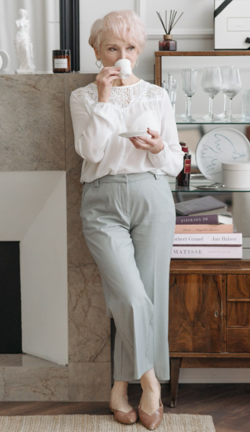
This is particularly useful if you’re introducing a colour you don’t normally wear. Instead of building an entire outfit around it, let the statement shade become the focal point against a quieter foundation.
Why this works
Neutrals tend to connect colours that might otherwise compete. They also make an outfit look more deliberate, which is one reason tonal neutrals have remained such a reliable part of sophisticated dressing.
If you’re unsure whether two colours work together, adding a neutral third element can often create the missing balance.
DID YOU KNOW?
Neutrals aren’t limited to black, white and grey. Shades such as camel, taupe, cream, chocolate brown, navy and even certain muted greens can function as neutrals because they are versatile enough to work with a wide range of colours.
2. Use the 60–30–10 Rule as a Starting Point
You don’t need to follow mathematical rules to dress well, but the 60–30–10 principle can be a useful way to understand colour proportion.
The idea is simple:
- 60% of the outfit is your dominant colour
- 30% is a secondary colour
- 10% is an accent
The proportions don’t need to be exact. Think of them as a visual guideline.
For example, a camel outfit could become:
60% camel — trousers and coat
30% cream — knitwear or blouse
10% burgundy — handbag or shoes
Or:
60% navy — trousers and blazer
30% white — shirt
10% red — bag, belt or shoes
This approach is particularly useful when you want to wear three colours without making the outfit feel chaotic.
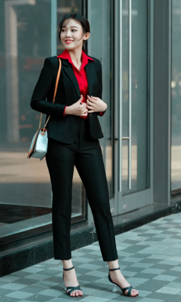
The smallest colour doesn’t necessarily have to be an accessory either. It could be a scarf, a neckline, a pair of trousers peeking beneath a coat or even a subtle print.
The real secret is hierarchy. When one shade clearly leads and the others support it, the outfit feels much more cohesive.
Colour isn’t the only element where visual hierarchy matters. The Ultimate Guide to Outfit Proportions: How to Balance Any Look explores how volume, length and shape can work together to create a balanced silhouette — principles that complement colour beautifully.
3. Understand the Difference Between Complementary and Harmonious Colours
The colour wheel can be useful, but you don’t need to become an expert in colour theory.
At its simplest, colours can be combined in several ways.
Complementary colours sit opposite one another on the colour wheel. They create stronger contrast and can produce a more dramatic effect.
Analogous colours sit next to one another, such as blue and green or pink and red. They tend to create a softer, more harmonious appearance.
Then there are tonal combinations, where you stay within variations of essentially the same colour.
For everyday elegance, analogous and tonal combinations can be particularly easy to wear.
Try:
- Burgundy + blush pink
- Navy + powder blue
- Olive + sage
- Chocolate brown + caramel
- Lavender + soft lilac
- Cream + beige + camel
For a more dramatic look, complementary or high-contrast combinations can be beautiful too.
The important thing is to consider intensity. Two very bright colours competing at exactly the same strength can be harder to balance than one vivid shade paired with a softer version of another.
4. Master the Most Elegant Neutral Combinations
Before experimenting with bold colour, it is worth mastering combinations that already have a naturally sophisticated quality.
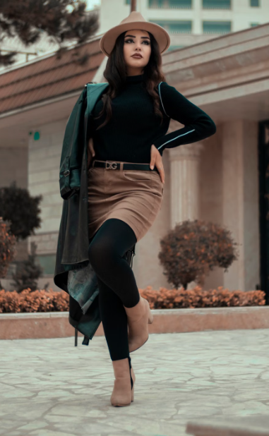
Cream + Camel
One of the easiest combinations for a luxurious-looking wardrobe. The difference between the two shades is subtle enough to feel refined while still creating dimension.
Chocolate Brown + Cream
Rich chocolate brown has become an increasingly important alternative to black, and it looks especially beautiful against warm ivory and cream.
Black + Camel
The contrast is classic without feeling predictable. A camel coat over an otherwise black outfit is one of the simplest ways to make everyday dressing feel polished.
Navy + White
Crisp, timeless and remarkably versatile. Navy and white can work for tailoring, casual separates, summer dressing and evening looks.
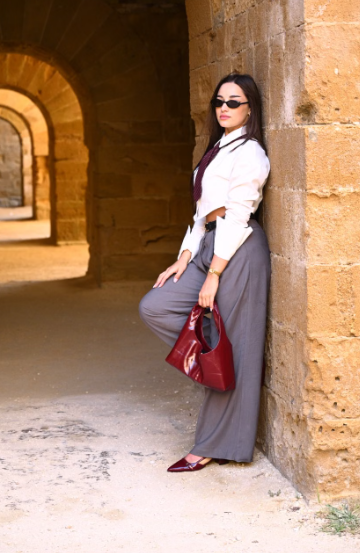
Grey + Burgundy
Grey provides the restraint while burgundy adds depth. The result feels sophisticated without relying on a traditional black-and-white combination.
These combinations are also useful when building a wardrobe because the pieces can easily be separated and worn with other colours.
If you’re interested in creating a polished wardrobe without relying entirely on expensive pieces, How to Look Expensive on a Budget: 12 Styling Rules That Actually Work explores how colour, fit, accessories and other small styling decisions can make an outfit feel considerably more refined.
STYLE TIP
When combining neutrals, don’t worry about matching every shade perfectly. Mixing slightly different tones — such as ivory, cream, beige and camel — can make an outfit feel richer and more sophisticated than wearing one neutral from head to toe.
5. Let One Bold Colour Do the Talking
You don’t need several bright colours to create an interesting outfit.
In fact, one strong colour surrounded by quieter shades can often make a much bigger impact.
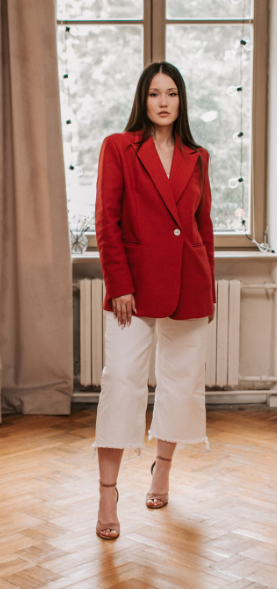
Imagine a simple cream trouser-and-shirt combination with a vivid red handbag. Or a chocolate-brown outfit with a rich emerald coat. The colour becomes memorable precisely because the rest of the outfit gives it space.
Some combinations worth trying:
Cream + red + tan
A classic base with a confident accent.
Chocolate brown + emerald
Rich, sophisticated and particularly beautiful in autumn and winter.
Navy + cobalt blue + white
A tonal approach to blue with enough contrast to keep it interesting.
Beige + butter yellow + cream
Soft and modern without feeling overly sweet.
Grey + burgundy + black
Elegant, slightly dramatic and easy to adapt for evening.
The key is not simply choosing a bold colour but deciding where you want the eye to go.
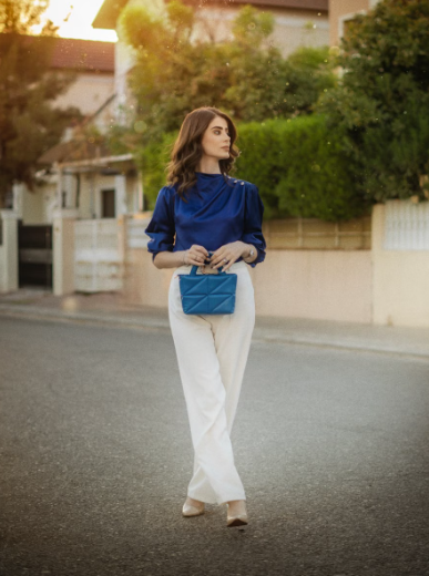
A brightly coloured coat naturally becomes the focal point. A bright shoe creates a smaller, more unexpected moment. A colourful handbag can add personality without changing the overall mood of a neutral outfit.
This idea of visual restraint is equally important when adding jewellery. If your clothing already features a strong colour or statement detail, How to Style Jewellery Without Overdoing It offers useful inspiration for keeping the finishing touches balanced rather than letting every element compete for attention.
And if an outfit starts to feel visually crowded, remember that editing can be just as important as adding. Our guide to Fashion Mistakes That Can Make an Outfit Look Less Polished explores how overly coordinated or excessive details can affect the overall impression.
6. Try Tonal Dressing for an Effortlessly Chic Look
If combining several different colours feels intimidating, start with just one colour family.
Tonal dressing means wearing different shades of the same colour, creating depth without introducing strong contrast.
Think:
- Ivory + cream + beige
- Pale blue + powder blue + navy
- Blush + dusty rose + burgundy
- Chocolate brown + caramel + tan
- Sage + olive + forest green
- Soft grey + charcoal + silver
The result can be incredibly sophisticated because the colours are naturally related.
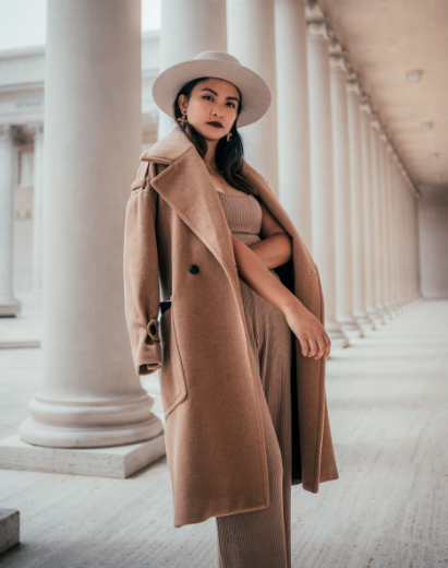
Tonal dressing also doesn’t have to mean wearing exactly the same shade from head to toe. In fact, varying the depth and intensity of the colour usually makes the outfit much more interesting.
A camel coat over a beige knit and cream trousers, for example, feels much richer than three pieces in exactly the same beige.
This approach is particularly useful when you want an outfit to look luxurious without being obviously styled.
7. Use Accessories to Introduce a Second or Third Colour
Accessories are one of the easiest ways to experiment with colour without committing to an entirely colourful outfit.
If you’re wearing a neutral base, your handbag, shoes, belt, scarf or jewellery can introduce another shade.
Imagine:
Black trousers + ivory shirt + burgundy handbag
or:
Cream dress + tan sandals + soft blue handbag
or:
Navy tailoring + white shirt + red shoes
The accessory doesn’t have to match anything exactly.
Instead, look for a relationship between the colours.
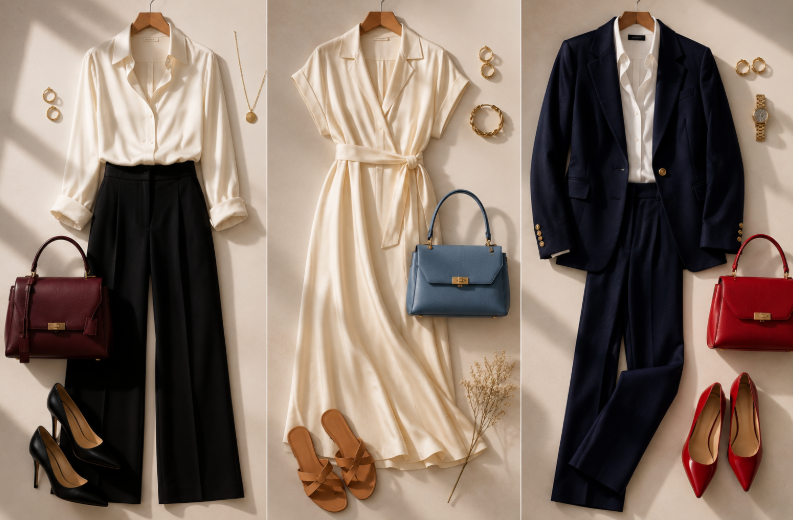
A burgundy handbag can work beautifully with a blush blouse even if there is no burgundy elsewhere in the outfit. A gold-toned accessory can warm up cream, camel and chocolate brown. A pale blue bag can introduce freshness to an otherwise neutral beige look.
Your handbag is particularly useful because it occupies enough visual space to make a colour statement without requiring you to wear that shade close to your face.
For more guidance on choosing the right colour, size and shape of bag for an outfit, see How to Choose the Right Handbag for Your Outfit.
The same principle works with shoes. A colourful shoe can be the smallest but most unexpected element of an outfit.
A useful rule
If you’re nervous about wearing colour, put it somewhere you can remove easily.
A bright handbag or pair of shoes allows you to experiment without committing your entire outfit to the shade.
8. Don’t Be Afraid of Unexpected Colour Combinations
Some of the most elegant outfits aren’t built around the combinations we instinctively reach for.
Once you’ve mastered neutrals and tonal dressing, try introducing colours that create a little more contrast.
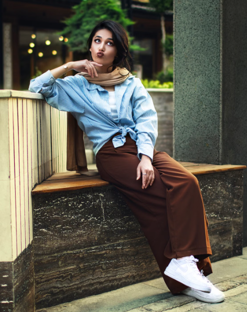
Some combinations worth experimenting with include:
Chocolate Brown + Powder Blue
The warmth of brown contrasts beautifully with the coolness of blue.
Burgundy + Blush Pink
Instead of treating pink and red as competing shades, use different intensities to create depth.
Olive + Pale Blue
The muted quality of olive prevents the blue from feeling too sweet, while the blue adds freshness to the earthy green.
Butter Yellow + Camel
A soft yellow can look remarkably sophisticated when paired with warm neutrals.
Red + Pink
This once-unexpected combination has become a fashion favourite because the colours create contrast while still sharing a warm, energetic quality.
Lavender + Chocolate Brown
The softness of lavender becomes more grown-up when grounded by a rich brown.
The secret is not to make every colour equally intense.
If you want to combine two strong colours, consider letting one dominate and allowing the other to play a supporting role.
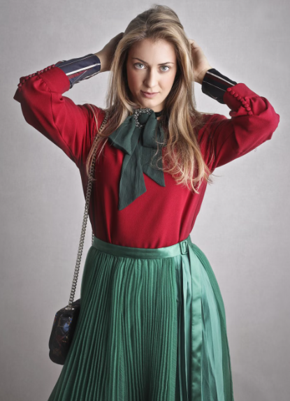
That distinction can turn a potentially overwhelming combination into a sophisticated one.
And don’t forget that colour is only one part of the equation. The silhouette, fabric and proportions of the clothing also influence how the combination is perceived.
Our guide to How to Dress for Your Body Shape Without Following Outdated Fashion Rules explores why understanding proportions and silhouettes should give you more freedom rather than impose more restrictions.
9. Consider the Colour of Your Accessories Before Adding More Clothing Colours
Sometimes an outfit doesn’t need another item of clothing to make the colour combination work.
It needs repetition.
If you’re wearing a burgundy blouse, for example, a burgundy handbag or shoe can subtly echo the colour without making the outfit look overly coordinated.
Likewise:
- Navy blazer + navy shoes
- Chocolate knit + chocolate handbag
- Burgundy dress + burgundy lip
- Cream trousers + ivory shoes
- Olive jacket + muted green handbag
The repeated colour doesn’t have to be identical. Similar tones can create the same effect.
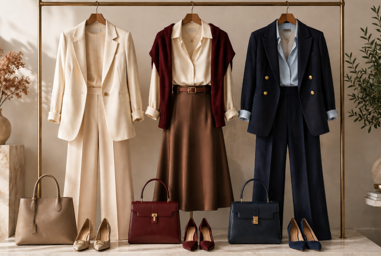
This is particularly useful when wearing a statement colour because repetition gives the eye somewhere else to find that shade.
It creates visual continuity.
But be careful not to interpret this as matching everything. The goal isn’t to have your shoes, handbag, belt and coat all in exactly the same colour.
One or two subtle echoes are usually enough.
If you’re styling a colourful outfit with jewellery, remember that metallics can also function almost like neutrals. Gold tends to work beautifully with warm colours such as camel, cream, burgundy and chocolate, while silver can complement cooler shades such as grey, blue and lavender.
10. Know When to Stop: The Art of Colour Restraint
One of the most important skills in colour dressing is knowing when you already have enough.
An outfit doesn’t become more stylish simply because you add another colour.
If you already have:
Cream + camel + burgundy
you may not need bright green shoes, a blue handbag and colourful jewellery as well.
Let the original combination breathe.
This is particularly important when wearing:
- Bold prints
- Colourful accessories
- Statement coats
- Strong tailoring
- Bright shoes
- Dramatic jewellery
The more visually interesting one element becomes, the quieter the surrounding elements can be.

This doesn’t mean minimalist dressing is always better. Maximalist colour combinations can look incredible when they’re intentional.
The difference is whether the colours appear to have been chosen together.
A useful test is to look at your outfit from a distance.
Does your eye immediately understand the main colour story?
If yes, you’re probably on the right track.
If your eye keeps jumping from one element to another, you may want to remove one colour or replace it with a neutral.
The best colour in the whole world is the one that looks good on you.
The sentiment behind this famous fashion saying from Coco Chanel is more useful than any rigid colour rule.
There may be combinations that are technically harmonious on a colour wheel but simply don’t feel like you. And there may be combinations that break conventional rules yet look fantastic because they suit your personality, wardrobe and confidence.
Colour theory is a tool.
It shouldn’t become a restriction.
11. Think About Your Skin, Hair and Overall Contrast
Colour combinations don’t exist separately from the person wearing them.
The same outfit can create a completely different impression depending on the wearer’s colouring and overall contrast.
This doesn’t mean you need to follow strict seasonal colour-analysis rules.
Instead, notice what happens when different shades are close to your face.
Some colours may make your complexion look brighter. Others may feel more harmonious when placed farther away, such as in a skirt, handbag or shoe.
If a colour you love doesn’t feel flattering near your face, you don’t necessarily need to abandon it.
Try moving it.
A beautiful emerald green might become a handbag. A vivid orange might work better as a shoe. A strong purple could become a skirt paired with a softer neutral top.
This gives you more freedom to enjoy colour without allowing one shade to dominate your entire wardrobe.
12. Build Colour Around the Pieces You Already Own
You don’t need to buy an entirely new wardrobe to become better at combining colours.
Start with the clothes you already wear most often.
Choose one reliable neutral — perhaps black, cream, navy, camel or chocolate brown — and experiment with three colours that work alongside it.
For example:
If your wardrobe is mostly black
Try:
Black + cream + burgundy
Black + camel + red
Black + grey + powder blue
If your wardrobe is mostly beige and cream
Try:
Cream + camel + chocolate
Beige + burgundy + ivory
Cream + olive + tan
If you wear a lot of navy
Try:
Navy + white + red
Navy + camel + powder blue
Navy + burgundy + cream
This is also why a versatile wardrobe foundation matters. When your core pieces are easy to combine, adding colour becomes much less complicated.
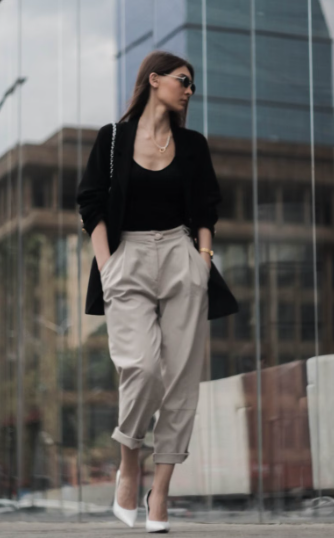
Rather than buying a new statement piece every time you want to create a different look, you can change the colour story through one blouse, handbag, scarf, shoe or accessory.
13. Use Prints as a Shortcut to Colour Coordination
Prints can actually make colour mixing easier because they have already done some of the work for you.
If a patterned blouse contains navy, cream and burgundy, you can pull one or two of those colours into the rest of the outfit.
For example:
Floral blouse containing navy + cream + burgundy
→ navy trousers
→ burgundy handbag
→ cream shoes
You don’t need to introduce a completely unrelated fourth colour.
Instead, let the print become your colour palette.
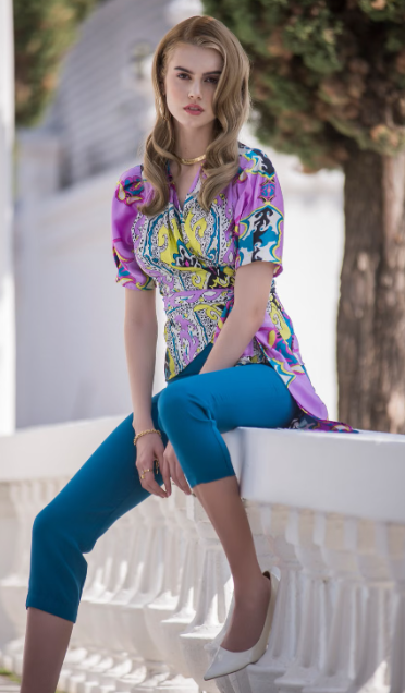
This is one of the easiest ways to create a sophisticated outfit because the colours already belong together visually.
The same principle works with stripes, checks, abstract prints and even subtle patterns.
The trick
Don’t try to match every colour in the print.
Choose one dominant shade and one supporting colour.
Everything else can remain neutral.
14. Adapt Colour Combinations to the Occasion
The same colour combination can feel completely different depending on how you style it.
A bold red and pink combination might feel playful during the day but sophisticated for evening when paired with sleek tailoring and refined accessories.
Similarly, cream and camel can feel relaxed with linen and flat sandals but luxurious with structured tailoring and heels.
Think about:
Daytime
Soft neutrals, lighter colours and relaxed contrasts tend to work beautifully.
Work
Navy, grey, cream, camel, burgundy and muted greens can create polished combinations without feeling overly formal.
Evening
Deeper shades, richer contrasts and metallic accents can create a more dramatic effect.
Summer
White, cream, butter yellow, pale blue, soft pink and warm tan naturally feel fresh.
Autumn/Winter
Chocolate, burgundy, forest green, navy, camel and charcoal create richer colour stories.
The colour doesn’t necessarily determine the formality.
Fabric, silhouette and styling do too.
Special occasions can also influence the colours you choose. If you’re dressing for a wedding, our guide to How to Dress as a Wedding Guest: Elegant Outfit Ideas for Every Dress Code explores how colour, setting and dress code work together.
15. The Fancylicious Formula for Elegant Colour Combinations
If you remember only a few principles from this guide, make them these:
Start with one dominant colour.
Let it establish the overall mood.
Add one supporting colour.
Choose something that harmonises rather than competes.
Introduce an accent.
A handbag, shoe, scarf or piece of jewellery can provide the final touch.
Consider proportion.
A strong colour doesn’t need to occupy much space to make an impact.
Don’t match everything.
Harmony is more sophisticated than perfect coordination.
And always leave room for personality.
The most interesting colour combinations aren’t necessarily the safest ones.
EDITOR’S NOTE
Elegant colour dressing isn’t about memorizing which colours you’re “allowed” to wear together. It’s about learning to recognize balance. Once you understand how colour, proportion, texture and contrast interact, you can experiment much more freely — and eventually develop combinations that feel unmistakably your own.
Final Thoughts
Learning how to mix colours in an outfit doesn’t require a perfect understanding of the colour wheel.
Start with neutrals.
Experiment with tonal dressing.
Introduce one bold shade.
Use accessories to test combinations.
Pay attention to proportion.
And when something feels slightly unexpected, don’t dismiss it immediately. Sometimes those are the combinations that give an outfit its personality.
The goal isn’t to create an outfit where every colour matches perfectly.
It’s to create one where everything feels as though it belongs together.
Because ultimately, elegant dressing isn’t about following rules.
It’s about knowing when to follow them, when to bend them and when to make your own.